Thursday, September 29, 2011

Photoshop: Colorize by Erasing Color

Colorize an Image by Erasing Layers

Another interesting way of "colorizing" an image is by pasting a black and white layer on top of the color layer and erasing the areas you want in color.  Confusing?  It will make sense after we try it.

Here's a sample image to get started [of course you can use your own]:
  1. Open an image.
  2. Do a CTRL+A (to "Select All") then CTRL+C (to "Copy)
  3. Go to Image > Mode > Grayscale to convert the image to grayscale ("black & white").
  4. Go to Image > Mode > RGB Color to convert the image back to color.
  5. Do a CTRL + V (to "Paste").
  6. Double-Click the bottom layers name ("Background") and change it to anything else (i.e. "Layer 0").
  7. Drag the bottom (grayscale) layer above the color layer.
  8. Select a soft (feathered) brush small enough to get details.
  9. Use the eraser tool to erase areas you want in color.
You can also view the video tutorial below for step-by-step instructions:

Wednesday, September 28, 2011

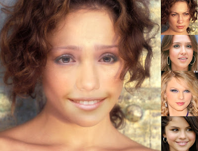
Photoshop: Project Frankenstein

Okay, this is one of the more bizarre PhotoShop projects I give.  :)  I call it Project Frankenstein.

In this project you will gather pieces of faces from different people, and then composite them into a single image.  You can choose male or female, young or old.  You will take one persons head... anothers eyes... anothers mouth... and anothers nose.  Just so you know, it's almost impossible to do this project without making something "creepy." It's amazing how you can take [what you consider] the most beautiful eyes, the most beautiful mouth, the most beautiful nose, etc. and put them together... and it's hideous.
You can start with Google Images or use pictures of your family or friends.

Some tips...  
  • On the left side of Google Images click "Large" for size.
  • On the left side of Google Images click "Face".
  • Start with a large picture of a head as the base to put the pieces.
  • Select pictures where the hair isn't covering the face.
  • Pick faces with approximately the same skin color.
  • Pick faces with similar lighting (i.e. from the same side).
  • Drop your layer opacity to position the features and then return it to 100%.
  • Use your eraser tool with a feathered edge to blend the features in.
Note: The question I often get during this project is: "When will we ever be taking different pieces of peoples faces and sticking them together?"  The answer is, probably never -- but this project teaches the skills necessary to smoothly merge images, focus on shadows, adjust color saturation, etc.  It's not the project I want you to perfect, it's your technique.

Good luck!  I'm looking forward to seeing your creations.  :)

Thursday, September 22, 2011

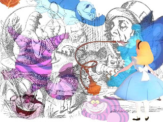
Photoshop: Collage Wallpaper

Today we are going to begin building a collage that we can use as a computer wallpaper. The collage must have a theme, include several images, have some sort of text (i.e. a title), and fit the dimensions of a typical computer screen.

Before we begin, I will demonstrate some of the cool layer styles and effects that you find useful in your project.  I will also demonstrate the basic collage building process.  You will then have the next two days to build your collage.
  1. Create a new Photoshop document using your choice of the following dimensions:
    1. 1024x768  (20% of computer screens use this resolution)
    2. 1280x1024  (18.2% use this resolution)
    3. 1280x800 (17.3%)
    4. 1440x900 (10.5%)
    5. 1680x1050 (10%)
  2. Sometimes it's better to fill your canvas with a certain color (i.e. black, blue, or green) to serve as a base for your pasted images.
  3. Begin finding images [within your theme as well as being classroom appropriate] and save them to a folder on your Thawspace or USB drive.  Make sure the images are large enough that you don't have to stretch them on your canvas.
  4. Begin "pasting in" images and dragging them to the best fit on your canvas.
  5. You may want to use a soft, feathered brush as an eraser and soften the edges of your images.
  6. You may also want to try adjusting the opacity on some of your images [layers] to help the layers "melt together" better.
  7. You may even try a color gradient overlay with low opacity for some interesting effects.
  8. Choose a font that fits your theme, and place a title on your page.
  9. Choose a small font and put your name on your new artwork.
  10. Try some layer styles (drop shadows, bevel & emboss, stroke, etc.) to improve your text layer.
Finally, make sure you save your file as a PSD (Photoshop Document) as well as a JPEG, then upload the JPEG to your Blogger portfolio.


Here are some examples of Photoshop collages:

Design and Composition Basics: The Rule of Thirds

The most basic principle in photography, layout or design is The Rule of Thirds.  The basic idea is that you can divide your photo into an equally divided 3x3 grid.
The idea is that the human eye focuses most on the areas where the lines intersect.  So if we put the focal point of the photo in one of the intersections, the image becomes more attractive or interesting.
Another use of the Rule of Thirds is to place the subjects eyes on the horizontal line.  Ideally one of the eyes would be on one of the interesctions, while the eyes would be looking to the opposite side into the empty space.  This image of a cat is fairly close.

If you are taking (or cropping an existing) landscape photograph, the Rule of Thirds can be used to help add interest to the shot.  Sometimes the horizon line is on [or close to] one of the two horizontal lines.  Sometimes the picture can be divided into three areas -- the foreground, the focal point, and the background.  In the example below, the horizon line follows the bottom line while the subject of the photo is exactly on the interesection.
Here are a few more examples demonstrating the Rule of Thirds:
Now look at the following photographs and see if they follow the Rule of Thirds -- and if so, in what ways:


The Rule of Thirds is utilized in movies as well as photographs.  This is an example of a commercial with the Composition Lines overlayed on the movie.
This guy did a music video about the Rule of Thirds:

A more advanced explanation about the Rule of Thirds can be seen in the video below:

http://blog.muddyboots.org/2007/07/rule-of-thirds.html

http://www.everydayhdr.com/?p=1367


Wednesday, September 21, 2011

PhotoShop: Colorize a Black & White Image

Today we will be learning to colorize a black and white image.  The image we are starting with, however, is already in color.  What we will do is take this image into PhotoShop, convert it to black & white, then colorize it.

1.  Click on the image (below) to view it full-size.
2.  Right-click and save the image to your folder.
3.  Open the image in PhotoShop.
4.  Convert it to Black & White by going to:  IMAGE > MODE > GRAYSCALE
5.  Balance it by going to: IMAGE > ADJUSTMENTS > AUTO CONTRAST
6.  Convert the image back to RGB Color by going to:  IMAGE > MODE > RGB COLOR
7.  Create a new layer:  LAYER > NEW > LAYER
8.  Pick a bright color (pink, blue, red, etc.)
9.  Choose a soft (feathered) brush and paint on your new layer over an object (hat, pants, overalls, etc.).  Don't worry about the bright, ugly color because we're going to adjust that in the next step.
10.  Next, adjust the opacity (transparency) of your painted layer by clicking the arrow next to OPACITY above the Layer.  Drag the arrow left or right to adjust the opacity. 

Here are a few examples of adding color to a black & white photograph to create different effects:


If [for some reason] you don't see your layers, click F7.


Also, if you have access to YouTube you can check out this video tutorial that I put together a few years ago.  It's on a Macintosh, but the concepts are the same:

Tuesday, September 20, 2011

Photoshop: Recoloring an Image with "Replace Color"

Today we will be playing with the "Replace Color" tool:

Step I: Getting Started
  1. Click on one of the sample images below to view it full screen
  2. Copy the image
  3. Open PhotoShop and create a New Document
  4. Paste the image

Step II: Making a "Warhol Grid"
  1. Go to IMAGE > CANVAS SIZE
  2. Change "Inches" to "Percent"
  3. Change BOTH Width and Height to 200 [percent].
  4. Click the "Upper-Left" Arrow
  5. Click OK
  6. Click VIEW > FIT ON SCREEN
  7. Paste another copy of your picture
  8. Use the arrow to drag the picture to the upper-right corner
  9. Paste another copy of your picture
  10. Use the arrow to drag the picture to the lower-left corner
  11. Paste another copy of your picture
  12. Use the arrow to drag the picture to the lower-right corner.
Step III: Changing Colors
  1. Select the layer that you want to adjust (top-right, bottom-left, and bottom-right)
  2. Go to IMAGE > ADJUSTMENTS > REPLACE COLOR
  3. Use the Dropper tool to click on one of the bright colors
  4. Hold Shift and select other shades of that color
  5. Drag the "HUE" slider left or right to adjust the color
  6. Repeat steps 1-5 for the other two squares.

Step IV: Finishing
  1. Add your name to your image
  2. Save your image to ThawSpace as a PSD
  3. Save your image to ThawSpace again -- this time as a JPG
  4. Log in to your portfolio (Blogger) page
  5. Create a New Post and insert your JPG picture
  6. Write a quick summary of the project and what you did to get the look you came up with
If you have access to YouTube you can watch the following video tutorial explaining this process:


Monday, September 19, 2011

Photoshop: The Gondola

Assignment:  We have accepted an assignment from a client to take a dull, scanned photograph and improve it for use in a poster, brochure, web site, etc.  The client has scanned a photograph of a gondola, but they think it is too hazy... and they don't like the speedboat in the center of the picture... and "the colors are a little blah".  We will use PhotoShop to correct these issues... and more.

Photoshop Tools/Options Used:
  • Ruler
  • Rotate Canvas
  • Crop
  • Levels
  • Clone Stamp
  • Dodge
  • Burn
  • Replace Color
  • Magic Wand
  • Paste Into
  • Free Transform

We will be using the following images to create our final project:
(Right-click each image and save to your computer, then open them in Photoshop.)
Part I: We will begin with the Gondola picture (p_start.psd):
  • Select VIEW > FIT ON SCREEN (shortcut is CTRL+0) to see the image as large as possible
  • Select the RULER tool (sometimes it's hidden under the EYEDROPPER) -- a shortcut is SHIFT+I which toggles through that toolset.
  • Drag the ruler along an edge that should be straight (i.e. the edge of the tower).
  • Select IMAGE > ROTATE CANVAS > ARBITRARY...
  • A suggested rotation is already in place based on your ruler line (this tool is trying to make the ruler line vertical or horizonal)... so click OK.
  • Use the RECTANGULAR MARQUEE tool (the box shape) to select as much of the picture as possible without including the black border (it's okay if you don't get all of the photo in the square).
  • Select IMAGE > CROP
  • Select VIEW > FIT ON SCREEN (again, to see the maximum image size)
  • Select IMAGES > ADJUSTMENTS > LEVELS
  • Drag the "black triangle" in toward the very beginning of the "mountain range" -- and do the same for the "white triangle" (click the "Preview" box to toggle this change to preview what it is doing) then click OK.
  • You now have a brightened, cropped image to work with for the next part.
Part II: Removing the Motor Boat / Using the Clone Stamp
  • Click the CLONE STAMP tool
  • Move your pointer over to a clear area of water -- about the same distance/depth as your motorboat (i.e. somewhere in the same horizontal line) and ALT+CLICK.
  • Move your mouse over to the center of the motorboat and slowly paint over the boat.  Notice the "+" shape where the CLONE STAMP is copying from.
Part III: Adjusting Highlights and Shadows
  • Click the DODGE tool (it looks like a black pushpin) and set the Range for HIGHLIGHTS and the Exposure to around 10%.
  • Adjust your brush size as necessary with the [ and ] keys.
  • Brush over the red and white striped tarp and notice how the highlights are getting brighter.  Try this on other tarps and the side of the boat which seems to get shinier.
  • Click the BURN tool (it looks like a hand pinching and is found under the DODGE tool) and set the Range for SHADOWS and the Exposure to around 5%.
  • Adjust your brush size as necessary with the [ and ] keys.
  • Brush over the boats/tarps just to get a little contrast.
Part IV: Replace the Orange Tarp
  • Use the ZOOM tool (it looks like a magnifying glass) to zoom in on the orange tarp -- making sure you can see the entire thing.
  • Use the LASSO tool and draw around the orange tarp (making a selection)
  • Select IMAGE > ADJUSTMENT > REPLACE COLOR
  • Click on the orange part of the orange tarp.  You should see a faint "mask" of the orange shape appear in the Replace Color box.
  • Hold down the SHIFT key and Click and Drag around the orange tarp trying to select ONLY the orange areas.  If you over-select (i.e. you accidentally go into the black) you can start this step over.
  • When you feel like you have a nice, sharp "mask" of the orange tarps shape, drag the HUE slider left and right.  Notice the colors changing on your image.
  • If you adjust the SATURATION slider and the LIGHTNESS slider, you can actually match the colors of the other tarps on the boat.
Part V: Make Blue Skies From Gray
  • Open the Clouds picture (p_clouds.psd).
  • Click on SELECT > ALL (or do CTRL+A)
  • Select EDIT > COPY (or do CTRL+C)
  • Go back to your Gondola picture.
  • Click the MAGIC WAND tool (SHIFT+W toggles this)
  • Click in one of the "gray" areas of the sky and notice how it selects some of the building tops.  We don't want that.
  • Drop your TOLERANCE down to 10 and see how that works.  Notice that it [probably] doesn't select the entire piece.  We can compensate for that by holding SHIFT and clicking in the "unselected" areas.
  • Continue SHIFT-Clicking the other "gray" areas of the sky throughout the picture.
  • Select EDIT > PASTE INTO (not PASTE)
  • Notice how ugly and unnatural this looks?  Don't worry -- go over to the OPACITY setting (above your LAYERS) and drag that down until it looks natural.  Mine is about 37% [this time].
  • When you are satisfied with your final product, select LAYER > FLATTEN IMAGE.
Part VI: Make the Before and After
  • Go to IMAGE > CANVAS SIZE
  • Change "inches" to percent and change the width (since this is a picture that is taller than it is wide, a side-by-side comparison works best -- so we will adjust the width) and change the 100 to 200 (making it twice the width).
  • Click on the Right Arrow (this means you want your current picture -- the "after" -- to be on the right) and click OK.
  • Copy your original image (in this case, p_start.psd) and Paste it into your finished image.  Use the MOVE tool (the black arrow) to drag it to the left side.
  • You may want to use your FREE TRANSFORM to rotate and resize the original so it fits better.
  • Add your name to the finished image.
  • Save your completed file as a JPEG image to your Thawspace. 
Part VII: Add to Your Portfolio
  • Go to your Blog (http://www.blogger.com/) and sign into your account.
  • Click New Post and make sure "Compose" is selected.
  • Click the IMAGE/PICTURE button.
  • Browse for your picture (from your Thawspace).
  • Add a description about the steps you completed or the process you used in putting this together.  You could even add the reason you did the project (e.g. A virtual client wanted you to clean up an image to use for print/online media).
  • Click PUBLISH POST.
  • Click VIEW BLOG.

Friday, September 16, 2011

Photoshop: Basic Levels

Next we are going to work with the LEVELS command in Photoshop:  
  1. Right-click the image below and select COPY.  
  2. Open PhotoShop 
  3. Select FILE > NEW
  4. PASTE
  5. Go to IMAGE > ADJUSTMENTS > LEVELS
  6. Drag the "white triangle" and the "black triangle" to the ends of the "mountain".
  7. Check/Uncheck Preview to see the difference.

This is an old tutorial done many years ago, but should work well enough with newer versions of Photoshop:

Photoshop: Photo Retouching

Today we are going to explore some photo retouching.  Next we will be creating a "before and after" picture to save to our portfolios.

First we will get an original source image to work with:
  1. Begin by right-clicking the image below and selecting "Copy Image" or "Copy" (depending on which browser you are using). 
  2. Open Photoshop and select FILE > NEW
  3. Select EDIT > PASTE
  4. Use the tools I demonstrate in class to touch up the photograph 
Next we will create the Before & After picture:
  1. Select IMAGE > CANVAS SIZE
  2. Change your settings to "PERCENT"
  3. Click on the "Right Arrow"
  4. Change your Width to 200% and click OK
  5. You should now have an image with space on the left
  6. Copy the original image (from this web page) again
  7. Paste the image into your Photoshop document and drag it to the left (as the "before" image)
  8. Use the Text tool to add your name to the image.
  9. Save your image to your Thawspace as a PSD and as a JPG
Finally, we will upload these pictures to our portfolio:
  1. Open your Blogger account (you may want to open Gmail and then go to http://www.blogger.com/).
  2. Select your "Portfolio" page.
  3. Click "New Post"
  4. Click the "Image" button in the post window.
  5. Locate and select your picture (the JPG version), then click "OK"
  6. Click on the picture in your post and select the size you want it displayed.
  7. Write a brief summary of what this project is about (either before, after, or on either side of your image).
  8. Click "Publish"
  9. Click "View Blog" (at the very top of your window)

Thursday, September 15, 2011

Finish Veggie Head and Upload to Portfolio Blog

Mr. Griffith is out sick today.  Please stay on task and get your Veggie Head project finished.

Reminder: Don't forget to use the Text command to add your name to the picture.

Remember to save your Veggie Head to your ThawSpace as a PSD (Photoshop Document) and then save it again as a JPEG.  PSD's are required if you ever need to edit individual layers again, while JPG files are the format you use to upload to Blogger, put in PowerPoint, etc.

After your file is saved, log in to your Blogger page and select "New Post".  Give your project a name (i.e. "PhotoShop: Veggie Head"), write about the process you used or the project in general (a paragraph is plenty), and click the Insert Picture button to choose your project.  You can drag your image to different sides of the window.  When you are finished, click Publish and view your blog.

Please let me know if there are any problems.  I will be checking my email (askgriff@gmail.com and rgriffith@kusd.lake.k12.ca.us).

Wednesday, September 14, 2011

Adobe Photoshop: Veggie Heads

Today we will explore some of the basic Photoshop tools and concepts, and then we will begin our first official Photoshop project -- the Veggie Head.  The Veggie Head project is a classic Photoshop tutorial which teaches you how to use a variety of tools and techniques to accomplish a seemingly easy task.
The task for today:

  1. Right-click the image above and select "Copy Image" (or "Copy Picture" depending on your browser)
  2. Open Adobe Photoshop
  3. Go to FILE > NEW (notice the size of the new image is the same size as the image on your "clipboard")
  4. Go to FILE > PASTE (you should now have two layers -- the veggies and a white background)
  5. Your task is to take the various pieces, copy them, paste them, and clean them up to create a "Veggie Head".  Some examples can be seen below:

Tuesday, September 13, 2011

The Ethics of Photo Manipulation

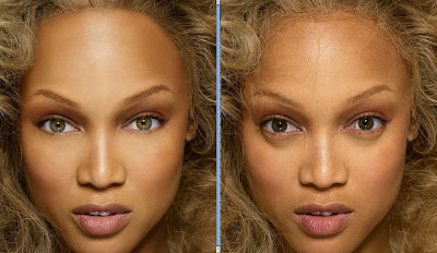
Today we will be discussing how "the media" uses programs like Photoshop to alter images for advertising or even news.  We will also discuss the ethics of such manipulation, and prepare for some basic image alterations for a mock client.

Below is a video (from Dove's Campaign for Real Beauty) which demonstrates how much the print media (magazines, billboards, etc.) rely on PhotoShop.  It also does a great job of demonstrating why young people today have difficulty living up to the images they see in magazines and advertising.  Even supermodels get Photoshopped before they are "good enough".


Here are some examples of Photo Manipulation in the media:


So when did "photo manipulation" begin?  Many people think it's a new invention which arrived with the invention of programs like Photoshop, but although technology has made photo manipulation easier it has been around almost since photography was invented.  Look at the following examples:
This well-known portrait of Abraham Lincoln was done around 1860.  It is actually a combination of Abraham Lincoln's head and Southern politician John Calhoun's body.
This well-known picture of General U.S. Grant atop his horse at a Civil War camp is actually a composite of three separate pictures.  (Click to view larger picture)

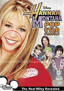
The big question is to decide when it is appropriate to manipulate a photo and how much manipulation should be done.  Are you removing a pimple from the tip of someones nose or doctoring a photo to make someone appear more guilty?  Are you removing a power line or a distracting road sign to improve the image, or are you removing wrinkles from someones' face for an anti-wrinkle cream?  Here are some more examples:
Click to enlarge.

Click to enlarge.


Another big question is should the news be able to create images to illustrate their stories?  Sometimes they are altered, sometimes cropped, and sometimes created outright.  So when is something "news" and when does it cross the line to become entertainment?

These two magazine covers used the same photo and sat on news stands the same week:

The same two magazines had these covers depicting the McCaughey septuplets.  One magazine (in this case, Newsweek) decided that they needed to replace Mrs. McCaughey's mouth with another that was more attractive.
Sometimes the same company can release the same picture -- and decide to "fix" it.

Here are some examples of when the news takes things out of [or put things into] the picture:
Iranian Missile Launch Test

Brad & Angelina were "caught together", although the photo's shown  were taken at different times and in different places -- Brad Pitt was in the Caribbean in 2005 and Angelina Jolie was in Virginia in 2004.

These photos of deceased soldiers (released by the Army in 2008) were later retracted when it was discovered that they were identical -- with the exception of the name and face, obviously.

Israeli newspaper Yated Neeman removed two female cabinet members from a photo of Prime Minister Netanyahu and President Shimon Peres -- and replaced them with male cabinet members.

Malaysian President Jeffrey Wong Su En produced this doctored photo as evidence that he had been knighted by the Queen of England.

Egypts newspaper Al-Ahram published this photo in which Egyptian President Mubarak was moved to the leadership position appearing to lead the group of world leaders.

This picture claiming to be Sarah Palin was printed in many newspapers during the last election.  I saw it in a San Francisco newspaper as recently as last Summer.  It was later revealed to be doctored.

Claiming a Rabbinical modesty code, Orthodox newspaper Der Tzitung removed pictures of women from this photo of President Obama's situation room during the take-down of Osama Bin Laden.

Here are a few pictures showing some editing/manipulation (click to view animation):


REMEMBER:

•  Add your name to your projects
•  Save Photoshop projects as PSD and JPG
•  Save Bryce projects as BR7 and [Save Image As] JPG
•  Save Sculptris projects as SC1 and JPG and export it as an OBJ.
•  Save Rhino projects as 3DM and JPG
•  Save Flash projects as FLA and go to FILE>PUBLISH SETTINGS and publish as SWF and JPG
•  Upload finished projects to your portfolio and/or your DeviantArt page
•  Keep checking your grade on PowerSchool