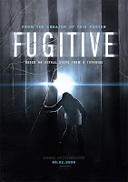
Today we will begin creating a Movie Poster with Adobe Photoshop, but before we begin we should ask, "What makes a
good movie poster?" A good poster is attention-grabbing, succinct, convincing and memorable. There isn't a specific color scheme, layout, or design that works best, but there are some definite characteristics that are general rules of thumb.
Some main characteristics of good poster design etiquette include:
- Arrange the image(s) and text without a lot of “busy” clutter.
- Arrange the design and lettering to attract the attention of passers-by.
- Consider how effective it will look next to other movie posters.
- Text and design should be large enough to be seen from a prescribed distance, usually 8-12 feet.
- Use harmonious color combinations.
- Design and text style must complement each other.
- Use a modern up-to-date art style, unless you are deliberately trying to create a poster that is mimicking an older style.
- The design should not detract from the impact of the words.
When I was a child, most of the advertising for upcoming movies was done via posters in the lobby of the local theater as "Coming Attractions." The movie poster could make [or break] a movie. Sometimes the movie poster was scarier [or more exciting] than the actual movie. A few iconic movie posters that I recall include:
You can view more examples of movie posters at sites like
http://onesheetdesign.com/ or
http://www.movieposter.com/.
Assignment Requirements:
- Dimensions: 27 inches (width) and 40 inches (height)
(This size is known as a One-Sheet and is the most common among US movie poster sizes)
- Resolution: 100dpi (or pixels per inch)
- Images: All images / photos must be high-quality /high-resolution
- File Type: Save your project as a PSD file until you have completely finished
- Text / Graphic Elements:
- Movie Title
- Names of Main Actors / Actresses
- Fictitious Credits
- Movie Rating
- Dolby Stereo Logo
- Hook or Tag-Line [optional]
- Quotes from Fictitious Movie Review(s) [optional]
Your assignments is to create a poster for a movie that doesn't exist. Some ideas include:
- A sequel or prequel to a movie that you would like to see
- A movie being made out of your favorite video game
- A movie made from your favorite book (or comic)
- A remake of a movie with better actors than the original
- A parody of a movie, book, actor, etc.
An example I created in class was for the fictional movie "Bieber Fever." It consisted of many separate pieces including a zombie, Justin Bieber (he's the one on the right), some "ruins" I downloaded from
PhotoXpress, a foggy cemetery, and an ominous red sky. I also downloaded a couple fonts; "Living Dead Dolls" for the title, and "Steel Tongs" for the "credits" at the bottom -- my personal favorite font for movie poster credits. Steel Tongs can be downloaded and installed free (
download it here). Not only does it have the proper style of movie poster text, but it has built-in characters for "Written by", "Directed by", etc. -- as well as logo's for DTS, DVD, Closed Captioning, etc.
 |
| Finished Version |
 |
| Components of Image |
- Action (Disaster): Stories whose central struggle plays out mainly through a clash of physical forces.
- Adventure: Stories whose central struggle plays out mainly through encounters with new "worlds."
- Comedy: Stories whose central struggle causes hilarious results.
- Coming-of-Age Drama: Stories whose central struggle is about the hero finding his or her place in the world.
- Crime: Stories whose central struggle is about catching a criminal.
- Detective Story/Courtroom Drama: Stories whose central struggle is to find out what really happened and thus to expose the truth.
- Epic/Myth: Stories whose central struggle plays out in the midst of a clash of great forces or in the sweep of great historical change.
- Fantasy: Stories which are animated, or whose central struggle plays out in two worlds - the "real" world and an imaginary world.
- Gangster: Stories whose central struggle is between a criminal and society. A cautionary tale, rooted in a main character who commits crimes (This genre is often blended with Film Noir).
- Horror: Stories whose central struggle focuses on escaping from and eventually defeating a Monster (either human or non-human).
- Love (Romance): Stories whose central struggle is between two people who each want to win or keep the love of the other.
- Science Fiction: Stories whose central struggle is generated from the technology and tools of a scientifically imaginable world.
- Social Drama: Stories whose central struggle is between a Champion and a problem or injustice in society. Usually the Champion has a personal stake in the outcome of the struggle.
- Thriller: Stories whose central struggle pits an innocent hero against a lethal enemy who is out to kill him or her.
- The Black Comedy: A comedy that uses death and morbid doings as the root of its humor. Surfaces regularly. Most recent incarnations, Very Bad Things and Pulp Fiction.
I suggest using components such as movie ratings, logos (i.e. Dolby, 20th Century Fox, etc.), etc. Here are some examples that you can click and copy -- or you can locate them online.
Some student-created "fake movie posters" can be found here (
http://www.phswebclass.com/BIMM/movie_projet/student_examples.htm) and some other examples include:
 Today we will taking a dieline (a shape that is flat and ready to be folded into a package) and designing [or redesigning] the package.


